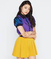
Juice=Juice release the covers for their 6th single
Juice=Juice released the covers for their upcoming single: Wonderful World/Ca va? Ca va?
There are 6 editions: 4 limited editions and 2 regular editions.
Let's have a look at them!
Limited A
Limited A is a very light and blue cover. All members have their own spot (with Karin having the biggest one). I love the light blue and the way they did Juice=Juice. I think it's cool they have their names on there. It's quite an attractive cover.
Limited B
Limited B has the outfits for Ca va? Ca va? Still not liking them a whole lot. The cover makes me think of a 50's pamflet, which is nice. I like the background color, although it's pretty boring. Their name looks nice and I like their names on it. For the girls, I really hate Karin's hair and outfit... I love how cute Tomoko and Yuka look. Outfits wise Sayuki and Akari have the best and cutest outfits. It's still a quite boring, which is brightend by tomoko's smile and pose.
Limited C
Limited C is really boring. I like the use of the blue, but there is not much going on. Sayuki has a "kill me now please" look. they all look kinda forces. I do like the way they did wonderfull world and they kinda showcase the outfits. But it's such a boring cover....
Limited D
This is a cute cover. It's simple, but nice. I like the flowers (although they are weird positioned). Tomoko and Yuka look adorable. The ca va? looks really nice. I like this cover, eventhough it would be better if they had white outfits and the flowers were not around their heads.
Regular A
Oh gosh, well.. Mm regular A is even more boring than limited C. Why are they so small? And Tomoko looks so small.. I don't know what to say about this... There is not much to see nor talk about.
Regular B
Wow. Okay. Well this cover is not boring at all. It's very colorfull, maybe a bit to much. I like the little pictures with their names and that there is also a group picture! I quite like the use of space, althought gosh it's really bold against all the other covers.
Overall
I think the covers are quite boring and simple. I like Limited A and I am drawn to Limited D and Regular B. They are quite funky and diffrent. I hope their MV's are more intresting...


Comments
Post a Comment