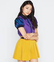
Juice=Juice reveal the covers for their first album!
It has been a long wait, but Juice=Juice are finally releasing their first album. And a big album it will be. There will be two cd's (three for the regular version). One cd will contain all their songs (The Best Juice), one cd will contain all new songs+ their last single (Brandnew Juice) and for the regular edition they also have a cover cd (The Cover Juice). But ofcourse we were all really waiting for the covers. Where they worth the wait?
Limited A
Limited A is very blue. It has all the girls in their own boxes, the name of the group at the top and the name of the album at the bottom. It's quite a boring cover to be honest. They all look fab, but there is nothing special about it.
Limited B
Limited B has a lot more color, Again they all have their own box. The title of the album is very small and the name of the group is not much bigger. It's quite a flashy cover and it's really ugly. I hate the colors and I don't understand why they aren't in a box with their own colors.. The girls look good, but the cover is just so ugly.
Regular
The regular cover is just a normal group picture with a blue/white background. It's nothing special but I guess this is quite a normal cover and it's nice. The girls all look great and cute.
Overall
Not very good covers. I hate Limited B and Limited A is not much better. I quite like Regular, but that might be because the others are just so boring.


Comments
Post a Comment