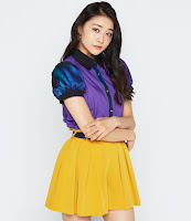
Juice=Juice/NEXT YOU release the covers for their new single!
Juice=Juice revealed the covers for their upcoming double a-side single!
The single will also be their debut single as NEXT YOU.
Next is you! / Karada Dake ga Otona ni Nattan ja nai will be released in 6 versions, so let's have a look at the covers!
Regular A
Regular A is the regular cover for Next You and it's quite obvious that their group color is Pink. Akari is center in the group, so it's nice to see they actually put her in the middle. I really like the font of Next is You! It looks a bit like an American Diner and I like it. It's a very simple cover, but the girls look good and everything looks nice.
Regular B
Regular B is the cover for Juice=Juice's A-side. I love the blue. It's a nice contrast to NEXT You and I really love the combination of the outfits with the blue. Tomoko looks so pretty!! Another simple cover, but a nice one.
Limited A
The limited A cover of NEXT YOU obviously has a circle theme. I really like how the cover looks and has this happy and bubbly vibe. I do wish they had putt Akari in Karin's circle, but meh. The girls looks pretty and I love the way NEXT YOU is presented so big.
Limited B
Limited B is for Juice=Juice's song and omg it's so iewwww. I hate how they did the pictures, it makes me dizzy and it does not show us the girls well. I do not like the colors and I do not like the serious look the girls give us. And does it say Juice=Juice or Juke=Juke?
Limited C
The last cover for NEXT YOU and is it cute. I really like how simple this cover is and how adorable the girls look. I like the fonts and the black stripe at the top just finishes the cover. I do think Karin's hair looks weird, but overall this cover is really pretty and simple.
Limited D
Limited D is the last cover for Juice=Juice and is it a nice one. I like this one sooo much better than Limited B. It's another simple cover and I like it. I do wish the title would be one color (blue or white or something), but not these colors, which makes it look like a circus.
Overall
I quite like the covers, NEXT YOU did get the best ones and I love their simplicity. But dang that Limited B is hideous.. The cover could have a bit more creativity, because they are just a few pictures slapped togheter, but they are not bad (exept B...). Favorites are the NEXT YOU covers and Regular B.


Comments
Post a Comment