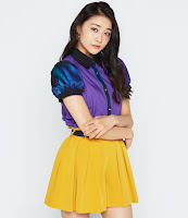
Tsubaki Factory released the covers for their debut single!
Tsubaki Factory will be releasing their debut single at the end of febuary.
It will be their first triple a-side "Hatsukoi Sunrise/JUST TRY!/Urawashi no Camellia".
The single will be released in 7 versions, 3 regular editions, 3 limited editions and one special edition. Let's have a look at this covers!
Regular A
Regular A is just a very light and simple cover. The title of the song is all over the cover in light blue. The girls are jumping and look like they have sunshine on their face. It's a really cute and simple cover and I adore the blue details.
Regular B
Just try! has another simple cover. The outfits look really nice agains the black and white and I love how big the title is. The girls themselfs don't look to interesting and the poses are so boring. But overall I quite like the cover. It's just simple.
Regular C
Wow the first cover for Urawashi no Camellia is so different. I like the traditional outfits and the colors. I love the purple background. It is quite weird that Yumeno, Ami and Mizuho have such different colors. It looks kind of weird. I love the class in the cover and the way the titles are styled.
Limited A
Limited A has the girls in a cover looking like a magazine. I really like the amount of text and how beautiful the girls look. They really are posing like models, which makes the cover look so nice.
Limited B
Oh wow, this cover is so dark. It's such a contrast to Hatsukoi. I really loe the individual pictures, yet I think they should keep Mao away from the highlighter and contouring powder, because her face looks so of. I am btw in love with Mizuho's picture. She is beautiful!
Limited C
Oh the promised outfits! I love them so much. Although the cover is so boring. The background is just meh, the mirror effect on the bottem is also meh. I like how big Camellia, as it is in the title and in their name. I like it. ANd ohhh Kisora looks so fab. I like it!
Special Edition
Oh this cover is mm, not my thing. The hair, o lord. I know it is traditional, but no not my style. Never thought I would say this, but Riko looks the absolute best. I like the sun and I think the cover has sa nice idea, but it's not my kind of cover, which is a shame as it is the special edition.
I quite like some of the covers, but some are just boring and way to simple. My absolute favorite is regular A, as it is so fresh, light and fun. Not bad for a debut single.


Comments
Post a Comment